Source: Wikipedia
The Color Wheel and How to Match Colors
Understanding the relationship between colors and being able to match them is a useful talent for trainers to have, both for dressing and choosing colors for training materials and pamphlets.
There are three basic categories of color theory that are logical and useful : The color wheel, color harmony, and the context of how colors are used. For example, if we have an assortment of fruits and vegetables, we can organize them by color and place them on a circle that shows the colors in relation to each other.
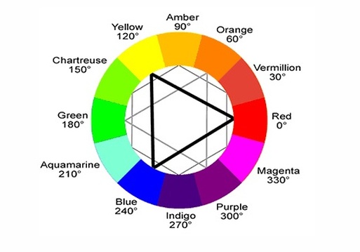
The Color Wheel: A color circle, based on red, yellow and blue, is traditional in the field of art. Sir Isaac Newton developed the first circular diagram of colors in 1666. Since then, scientists and artists have studied and designed numerous variations of this concept.
There are also definitions (or categories) of colors based on the color wheel. We begin with a 3-part color wheel.
Primary Colors: Red, yellow and blue
In traditional color theory (used in paint and pigments), primary colors are the 3 pigment colors that can not be mixed or formed by any combination of other colors. All other colors are derived from these 3 hues.
Secondary Colors: Green, orange and purple
These are the colors formed by mixing the primary colors.
Tertiary Colors: Yellow-orange, red-orange, red-purple, blue-purple, blue-green & yellow-green
These are the colors formed by mixing a primary and a secondary color. That's why the hue is a two word name, such as blue-green, red-violet, and yellow-orange.
Color Harmony. Harmony can be defined as a pleasing arrangement of parts, whether it be music, poetry, color, or even an ice cream sundae.
In visual experiences, harmony is something that is pleasing to the eye. It engages the viewer and it creates an inner sense of order, a balance in the visual experience. When something is not harmonious, it's either boring or chaotic. At one extreme is a visual experience that is so bland that the viewer is not engaged. The human brain will reject under-stimulating information. At the other extreme is a visual experience that is so overdone, so chaotic that the viewer can't stand to look at it. The human brain rejects what it can not organize, what it can not understand. The visual task requires that we present a logical structure. Color harmony delivers visual interest and a sense of order.
In summary, extreme unity leads to under-stimulation, extreme complexity leads to over-stimulation. Harmony is a dynamic equilibrium.
Some Formulas for Color Harmony
1. A color scheme based on analogous colors
Analogous colors are any three colors which are side by side on a 12 part color wheel, such as yellow-green, yellow, and yellow-orange. Usually one of the three colors predominates.
2. A color scheme based on complementary colors
Complementary colors are any two colors which are directly opposite each other, such as red and green and red-purple and yellow-green. Look at an orchid or purple flower and notice that here are several variations of yellow-green in the leaves and several variations of red-purple in the flower. These opposing colors create maximum contrast and maximum stability.
3. A color scheme based on nature
Nature provides a perfect departure point for color harmony. For instance, red yellow and green create a harmonious design, regardless of whether this combination fits into a technical formula for color harmony.
Color also changes according to context. Red will look much more vivid against a black background, but possibly rather lifeless against orange. Put a red square on a white page and the effect changes again. Think about the context of your colors, especially backgrounds when you are presenting!
Source:colormatters.com
There are three basic categories of color theory that are logical and useful : The color wheel, color harmony, and the context of how colors are used. For example, if we have an assortment of fruits and vegetables, we can organize them by color and place them on a circle that shows the colors in relation to each other.
The Color Wheel: A color circle, based on red, yellow and blue, is traditional in the field of art. Sir Isaac Newton developed the first circular diagram of colors in 1666. Since then, scientists and artists have studied and designed numerous variations of this concept.
There are also definitions (or categories) of colors based on the color wheel. We begin with a 3-part color wheel.
Primary Colors: Red, yellow and blue
In traditional color theory (used in paint and pigments), primary colors are the 3 pigment colors that can not be mixed or formed by any combination of other colors. All other colors are derived from these 3 hues.
Secondary Colors: Green, orange and purple
These are the colors formed by mixing the primary colors.
Tertiary Colors: Yellow-orange, red-orange, red-purple, blue-purple, blue-green & yellow-green
These are the colors formed by mixing a primary and a secondary color. That's why the hue is a two word name, such as blue-green, red-violet, and yellow-orange.
Color Harmony. Harmony can be defined as a pleasing arrangement of parts, whether it be music, poetry, color, or even an ice cream sundae.
In visual experiences, harmony is something that is pleasing to the eye. It engages the viewer and it creates an inner sense of order, a balance in the visual experience. When something is not harmonious, it's either boring or chaotic. At one extreme is a visual experience that is so bland that the viewer is not engaged. The human brain will reject under-stimulating information. At the other extreme is a visual experience that is so overdone, so chaotic that the viewer can't stand to look at it. The human brain rejects what it can not organize, what it can not understand. The visual task requires that we present a logical structure. Color harmony delivers visual interest and a sense of order.
In summary, extreme unity leads to under-stimulation, extreme complexity leads to over-stimulation. Harmony is a dynamic equilibrium.
Some Formulas for Color Harmony
1. A color scheme based on analogous colors
Analogous colors are any three colors which are side by side on a 12 part color wheel, such as yellow-green, yellow, and yellow-orange. Usually one of the three colors predominates.
2. A color scheme based on complementary colors
Complementary colors are any two colors which are directly opposite each other, such as red and green and red-purple and yellow-green. Look at an orchid or purple flower and notice that here are several variations of yellow-green in the leaves and several variations of red-purple in the flower. These opposing colors create maximum contrast and maximum stability.
3. A color scheme based on nature
Nature provides a perfect departure point for color harmony. For instance, red yellow and green create a harmonious design, regardless of whether this combination fits into a technical formula for color harmony.
Color also changes according to context. Red will look much more vivid against a black background, but possibly rather lifeless against orange. Put a red square on a white page and the effect changes again. Think about the context of your colors, especially backgrounds when you are presenting!
Source:colormatters.com
|
|
SIMILAR COLOR THERAPY FOR TRAINERS ARTICLES:
How Color Could Affect Your Mood How Color Therapy Supports Body Immunity Color Therapy For Winter Blues |